showModal
- Updated:
Shows a UI blocking informational dialog to the end user.
Description
The showModal capability is used to show a UI-blocking informational dialog to the end user. The recommended use for a modal is to show information and not to display a workflow. If it is desired to have a secondary workflow in a modal, then showOverpanel should be used to render a module.
The return type of showModal is a promise. That promise resolves when the modal is closed. Since a modal blocks other UI interaction until the user selects a button, the implementer often cares about which button was selected. The promise is resolved with the actionName associated with the button that was selected.
Signature
tecton.actions.showModal(modalOptions: PlatformModalOptions): Promise<string>;export interface PlatformModalOptions {
title: string;
message: string;
modalType?: ModalType;
button1?: ModalButton;
button2?: ModalButton;
button3?: ModalButton;
close?: boolean;
isBlocking?: boolean;
customMarkup?: string;
msgHasMarkup?: boolean;
transInfo?: Array;
infoList?: string[];
addlInfo?: string;
refocus?: ModalFocusTarget;
refocusContainer?: ModalFocusTarget;
testId?: string;
}export interface ModalButton {
text: string;
actionName: string;
}export type ModalFocusTarget = HTMLElement | string;export type ModalType = 'success' | 'error' | 'info' | 'warning';Usage
A common use of showModal is to display success or detail information to the user after a transaction has been created or processed.
tecton.actions.showModal({
    title: 'Funds Transfer #456465',
    message: "Your funds transfer was successfully processed on 4/5/2019",
    modalType: "info",
    transInfo: [{
        label: 'From Account',
        value: 'Regular Checking x87234'
    }, {
        label: 'To Account',
        value: 'Regular Savings'
    }, {
        label: 'Amount',
        value: '$200.00'
    }, {
        label: 'Memo',
        value: 'Transfer to savings.'
    }]
});
Modals are also often used to confirm user actions. In this example, a modal is shown to confirm that the user wants to leave the application when clicking an external link.
tecton.actions.showModal({
    title: 'Leaving Application: External Link Clicked',
    message: `You are about about to be navigated to out of online banking. Do you want to proceed?`,
    close: false,
    button1: {
        text: 'Yes',
        actionName: 'LEAVE'
    },
    button2: {
        text: 'No',
        actionName: 'STAY'
    },
    refocus: 'main-content',
    refocusContainer: 'external-link-container'
}).then(function(actionName) {
    if (actionName === 'LEAVE') {
        tecton.actions.openURL('https://bit.ly/2KnkROu', { showInOverpanel: false, nativeBrowserIfInApp: false, requiresToken: false });
    }
});
Additional Information
When using the showModal action, there are important details to keep in mind.
Handling User Events
The showModal capability lets you know which option the user clicked by utilizing the value returned from the Promise. Using the below code as an example, if you provide an actionName of "confirm" to the button1 object and the user clicks that button, the modal will close, and the promise will resolve with a value of "confirm."
If, however, the user clicks the close button or icon in the modal, the modal will close and the promise will resolve with a default value of "close". This is so you can perform any necessary actions based on whatever action the user takes while the modal is displayed.
const actionName = await tecton.actions.showModal({
  title: "Leaving so soon?",
  message: "Click 'Okay' to be logged out.",
  button1: {
    text: "Okay",
    actionName: "confirm",
  },
});

switch (actionName) {
  case "confirm":
    tecton.actions.navigateTo("logout");
    break;
  case "close":
    tecton.actions.navigateTo("dashboard");
    break;
}
Restoring Focus
refocus can provide a fallback focus target for the platform to use if the original active element cannot be restored
after the modal closes. refocusContainer can provide a container used to find sibling fallback targets matching the
original focused element tag.
Both options accept an element id, selector, or HTMLElement in UUX. When calling showModal from an SDK extension,
prefer passing a string id or selector because modal options are serialized across the platform message bus.
Using Custom Markup
When passing HTML to the showModal Capability via the customMarkup property, it is essential to note that this HTML passes through DOMPurify to ensure that no malicious content is making its way through. While this removes things like custom <style> or <script> tags, it will also remove references to Web Components that are not included in the following list:
q2-avatarq2-badgeq2-detailq2-iconq2-itemq2-listq2-loadingq2-messageq2-currencyq2-relative-timeq2-tooltip
We do this because not every Web Component is intended to be used in the modal (e.g., form fields, data tables, steppers, etc.), so we enforce it at this layer.
Example
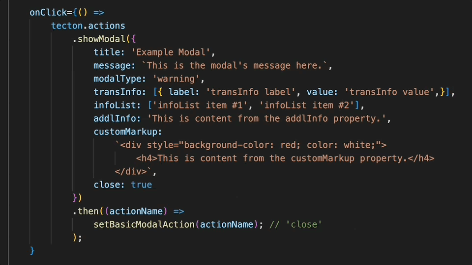
In this example, showModal is configured to render with "warning" modal styling in place. As the modal pops up near the top-center of the platform's UI, the background behind the modal becomes dimmed. The modal title and message are prominently displayed at the top of the modal window, just beneath an alert icon.
In the content found below the title and message, the string values provided to several other configuration options can observed. In descending order they are: customMarkup, transInfo, addlInfo and infoList.
The visual impact of a style attribute included the in customMarkup parameter can be observed, transInfo labels are bolded, and infoList items are centered as an unordered list.
Upon clicking the close button at the bottom of the modal, a default actionName of "close" is dispatched to the promise's fulfillment handling block.
Captured on UUX version 4.6.0.10A.
Parameters
Some parameters are only supported by specific platforms. Platform support for individual parameters will be indicated with a badge below the parameter name.
modalOptions.titlemodalOptions.messagemodalOptions.modalTypemodalOptions.button1modalOptions.button2modalOptions.button3modalOptions.closemodalOptions.isBlockingmodalOptions.customMarkupmodalOptions.msgHasMarkupmodalOptions.transInfomodalOptions.infoListmodalOptions.addlInfomodalOptions.refocusmodalOptions.refocusContainermodalOptions.testIdPlatform Support
Frequently Asked Questions
There is 1 frequently asked question related to this page.
Changelog
The changelog provides a detailed history of new features, improvements, and bug fixes going back to Tecton 1.30.0. If the button is disabled, it indicates there have been no detectable changes since then.