showOverpanel
- Updated:
Launches a Tecton application in a modal-like, platform-level overlay.
Description
showOverpanel launches a Tecton application in a platform-level overlay. The overpanel can return data when closed via closeOverpanel.
Signature
tecton.actions.showOverpanel(overpanelPath: string, params?: Record<string, string>, options?: OverpanelOptions, useRouteConfig?: boolean): Promise<T>;export interface OverpanelOptions {
fullWidth?: boolean;
size?: string;
height?: string;
testId?: string;
isBlocking?: boolean;
}Usage
Show terms and conditions overpanel and handle acceptance.
document.querySelector('#terms-conditions-link').addEventListener('click', function() {
    tecton.actions.showOverpanel('termsAndConditions', {type: 'user'}).then(function(resolutionData) {
        if (resolutionData.accepted) {
            // User accepted terms and conditions. Proceed with registration.
        }
    });
});
Additional Information
When using the showOverpanel action, there are important details to keep in mind.
Configuring Overpanels
In the code example above, a module is opening in an overpanel. For this to be successful, "termsAndConditions" - the argument passed to showOverpanel - must be in the configuredOverpanels section of the feature configuration file.
In addition to passing the options object as an argument in the showOverpanel invocation, you can add an options object to the feature configuration file to customize the default appearance of the overpanel module. (Enabled in UUX 4.6.1.1)
See more about the ways to configure your overpanels in our Modules as Overpanels guide.
{
  "configuredOverpanels": {
    "termsAndConditions": {
      "featureName": "PeerLending",
      "moduleName": "TandC"
    }
  }
}
Overpanel Layering
Overpanels do not layer, so showOverpanel cannot be called from within an overpanel. This function will not be available to a Tecton application currently rendered into the overpanel. Overpanels will need to be closed before another overpanel can be opened.
Mobile Considerations
For better UX support in small screen devices, UUX will ignore the height property and overpanels will default to full viewport height automatically if the screen height is shorter than 768px.
Example
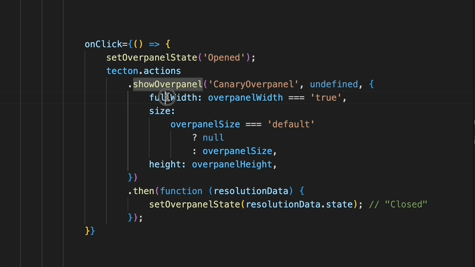
In this example, showOverpanel is provided arguments to modify the width and height of the overpanel. Upon calling showOverpanel, the overpanel will slide upwards into the view. Upon calling closeOverpanel, the overpanel will slide downwards and out of the view. The closeOverpanel method is provided resolution data that will be accessible from within the showOverpanel's Promise handling once the promise has been fulfilled.
Captured on UUX version 4.6.0.10A.
Parameters
Some parameters are only supported by specific platforms. Platform support for individual parameters will be indicated with a badge below the parameter name.
overpanelPathparamsoptions.fullWidthoptions.sizeoptions.heightoptions.testIdoptions.isBlockinguseRouteConfigRelease Notes
Platform Support
Frequently Asked Questions
There is 1 frequently asked question related to this page.