Button
- Updated:
Use for triggering actions including submit, save, cancel, or delete.
Development
Themed Buttons
The intent attribute is used to indicate the role of the button which will affect how it is styled according to your theme.
Currently, the following themed options are supported:
- workflow-primary - the button executes the primary action of a workflow or dialog. Typically, there is only one primary action for each part of a workflow. Examples: "submit," "confirm," "next"
- workflow-secondary - the button executes a secondary action in a workflow or dialog. Examples: "cancel", "go back," "edit," "submit without save"
- neutral - the button falls outside of the "primary" or "secondary" workflow, and needs more visibility than a static link but more than subtle than a bold button. Examples: Call-to-action
If you add instances of neutral buttons to your project, it is strongly recommended that they are not added to the bottom of workflows and that they are not paired with either workflow-primary or workflow-secondary buttons.
<q2-btn intent="workflow-secondary">
  Secondary button
</q2-btn>

<q2-btn intent="workflow-primary">
  Primary button
</q2-btn>

<q2-btn intent="neutral">
  Neutral button
</q2-btn>
Icon Buttons
You can easily add icons to your buttons in the same way you would add text. Tecton's implementation of this is pretty simple and allows you to show icons in three different ways.
Icon only
Just add the q2-icon directly to the button's inner HTML.
<q2-btn intent="workflow-primary">
  <q2-icon type="edit"></q2-icon>
</q2-btn>
Icon left
Add the q2-icon as the first element in the button's inner HTML, followed by a span containing the text to be displayed in your button.
<q2-btn intent="workflow-primary">
  <q2-icon type="edit"></q2-icon>
  <span>Edit</span>
</q2-btn>
Icon right
Add the q2-icon as the last element in the button's inner HTML, followed by a span containing the text to be displayed in your button.
<q2-btn intent="workflow-primary">
  <span>Edit</span>
  <q2-icon type="edit"></q2-icon>
</q2-btn>
Note: Tecton ensures that only one icon is displayed per button.
Custom Icon Buttons
While not recommended, it is possible to use custom icons within a q2-btn component, if the one you need is not provided by the Tecton Icon. To do so, we recommend inlining the SVG code for your icon to help take advantage of theming properties provided by Tecton, like the example below:
<q2-btn intent="workflow-primary">
    <svg
        xmlns="http://www.w3.org/2000/svg"
        viewBox="0 0 24 24"
        style="width: var(--tct-icon-size, 24px); height: var(--tct-icon-size, 24px); stroke: currentcolor;">
        <path d="M2 22 22 2M2 13 13 2M4 2 2 4M11 22l11-11M22 20l-2 2"/>
    </svg>
    <span>Circle Icon Button</span>
</q2-btn>
Unstyled Buttons
You can use q2-btn as an unstyled semantic button. Simply omit all optional attributes such as intent, icon, badge, and block to use an unstyled q2-btn.
Some guidelines for using unstyled buttons:
- Apply styling to content within the **
q2-btn, not on the button itself. **This will preserve the full clickable area of the button element. - **Don't put interactive elements, e.g. links, inputs, and other buttons, within the button. **Nesting interactive elements in this way is not semantic and frequently results in a poor experience for users that rely on screen readers and other assistive technology.
<q2-btn>
  An unstyled q2-btn 👋
</q2-btn>
Redirecting Users with Buttons
Sometimes, when you click a button, you want to navigate the user to another page instead of performing an action on the page. This component doesn't have an option to render it as a hyperlink (That's what the link component is for), but this is still achievable by using the click event handler, just like you would any other action. It looks like this:
const navigateBtn = document.querySelector("q2-btn");

navigateBtn.addEventListener("click", () => {
  window.location.href = "https://google.com";
});
While this, works fine, there are some important things to note:
- If you are trying to navigate to a specific location within the platform from an SDK extension, you should use the navigateTo capability.
- If you are trying to navigate somewhere within your CSR app, there is likely a different API besides
window.locationthat should be used for performing the necessary action.
Slots
The q2-btn element has one slot that can be used to insert custom content into the component.
An optional slot to display a custom coin button label.
Properties
The q2-btn element has one or more properties that support text localization. Those properties are indicated by the localizable badge in the description.
blockThe component expands to fill the width of its parent element.
disabledMarks the component as disabled and displays a not-allowed cursor on hover.
formAssociates the button with a <form> element by form ID.
hideLabelhide-labelHides the label, and assigns its value to the aria-label attribute on the <button> element.
intentIndicates the role of the component in the workflow, which will apply appropriate styling to the component.
labelDefines the text content of the button if it is not provided in the <slot> of the element.
Also used for the aria-label of the <button> element when only displaying an icon.
loadingDisplays the button with a loading spinner to indicate something is happening in the background and the user should not click again.
sizeDefines the size of q2-btn, it renders as default size if not provided.
typeThe default behavior of the button.
Events
The q2-btn element exposes events that can be used to send and receive data from the component based on user interaction.
tctClick
Emitted when the button is clicked.
Event Detail Type signature
anyDependencies
This component uses other components in the Tecton library, including:
q2-loading
Dependents
Other components in the Tecton library use this component, including:
q2-action-sheetq2-calendarq2-card-imageq2-data-tableq2-dropdownq2-editable-fieldq2-file-pickerq2-inputq2-modalq2-month-pickerq2-otpq2-paginationq2-sectionq2-stepperq2-tab-container
Design
Introduction
This page hosts the rules and guidance around placing buttons in Q2 related products, using the tecton q2-button and its many variants.
Workflows consider:
- Forms
- Page level actions
- Intrapage actions
- Content blocks or widgets
- Modals
- Flyouts
- Errors
Consistency
Consistant Usage
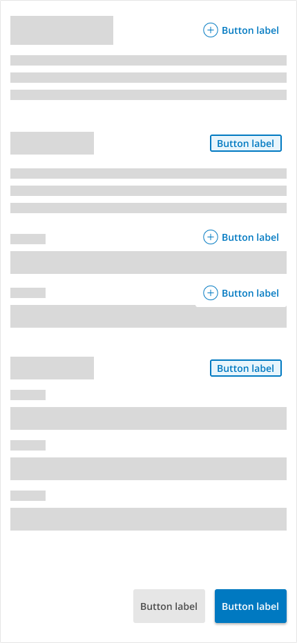
Create consistency in actions and clearly described and familiar actions on each page...
Inconsistent Usage
... avoid Inconsistency in the hierarchy of actions.
Button Intent Guidlines
Primary
<q2-btn intent="workflow-primary" type="button" size="medium">My Button</q2-btn>
The primary action is the most salient action on the page.
- Prominence: The primary button is usually a page's most visually prominent button. It stands out through its size, color, placement, or a combination of these factors. Its prominence makes it immediately noticeable to users, drawing their attention to the most critical action.
- Clear Call to Action (CTA): The primary button typically represents the main action that the user is expected to take on a particular screen. It should have clear and concise text that tells users exactly what will happen when they click on it. For example, instead of using generic labels like "Submit" or "Confirm," it's better to use action-oriented labels like "next" "enroll" or "Get Started."
- Hierarchy: In designs with multiple buttons, the primary button establishes a hierarchy by signaling the most important action. This helps users prioritize their actions and focus on the key task. Secondary actions, if present, are typically represented with less prominent buttons or links.
- Consistency: Maintaining consistency in the design and placement of primary buttons across different screens or pages within an application or website enhances usability. Users become familiar with the primary button's appearance and location, which reduces cognitive load and makes navigation more intuitive.
- Accessibility: Accessibility considerations are crucial in UX design. Primary buttons should be designed with sufficient contrast, making them easy to distinguish for visually impaired users. Additionally, they should be easily accessible via keyboard navigation and compatible with screen readers.
- Feedback: Interaction with the primary button should provide clear feedback to users, confirming that their action has been successfully completed or guiding them in case of errors. Visual feedback such as changes in button appearance (e.g., color change, animation) or informative messages helps users understand the outcome of their action.
Primary Buttons Guidelines:
-
- There should only be a single primary button on the page or isolated object like a card, modal, or flyout
- Attempt to keep consistency with other pages in the placement of the primary action
- Examples: "submit," "confirm," "next"
Secondary
<q2-btn intent="workflow-secondary" type="button" size="medium">My Button</q2-btn>
Secondary buttons are supporting Actions or "negative" actions
- Supporting Actions: Secondary buttons are often used for actions related to, but less critical than, the primary action. These actions may include secondary tasks, alternative options, or features that are less frequently used. For example, on a form, the primary button might be "Submit," while the secondary button could be "Cancel" or "Save Draft."
- Visual Hierarchy: Secondary buttons help establish a visual hierarchy within a user interface by distinguishing less important actions from the primary ones. They are usually styled differently from primary buttons, such as smaller, less prominent in color, or placed in a less prominent location. This visually guides users to focus on the primary action first.
- Fallback Options: In some cases, secondary buttons can serve as fallback options or alternatives to the primary action. For example, if the primary action requires a user to make a purchase, the secondary button might offer an alternative action, such as "Learn More" or "Continue Shopping."
- Confirmation and Dismissal: Secondary buttons are often used in confirmation dialogs or modals to provide users with choices other than the primary action. For instance, in a confirmation dialog for deleting a file, the primary button might be "Delete," while the secondary button could be "Cancel" or "Keep."
- Navigation and Contextual Actions: Secondary buttons can also navigate or trigger contextual actions within an interface. For example, in a file management application, the primary button might be "Open," while secondary buttons could include actions like "Rename," "Delete," or "Move."
- Consistency and Predictability: Like primary buttons, maintaining consistency in the design and placement of secondary buttons across different screens or pages improves usability. Users should be able to predict the function of a secondary button based on its appearance and context within the interface.
- Accessibility: Similar to primary buttons, secondary buttons must be accessible. They should be easily distinguishable from primary buttons, accessible via keyboard navigation, and compatible with assistive technologies.
Secondary Buttons Guidelines:
- Secondary buttons are offered as an alternative action and are less important than the primary action.
- Examples: "back," "submit without save"
Neutral
<q2-btn intent="neutral" type="button" size="medium">My Button</q2-btn>
- Non-Committing Actions: Neutral buttons are often used for actions that are neither primary nor secondary in importance. These actions are typically non-committing or have neutral consequences.
- Dismissing Alerts or Notifications: Neutral buttons can be used to dismiss alerts, notifications, or messages that provide information but don't require any immediate action from the user. For example, a neutral button labeled "Dismiss" might be used to close an informational banner at the top of a webpage.
- Maintaining Balance: In interfaces where primary and secondary actions are clearly defined, neutral buttons help maintain a balance by providing an option for actions that don't fit into either category. This prevents clutter and confusion in the interface.
- Promoting Clarity and Usability: Designers can improve clarity and usability for users by clearly labeling neutral buttons and using them consistently throughout the interface. Neutral buttons help users understand their options and easily navigate the interface.
Neutral Buttons Guidelines:
-
- These button actions are typically non-committing or have neutral consequences
- An example is a page with many actions that have equal weight of importance i.e. Composable dashboard
Neutral Text
<q2-btn intent="neutral-text" type="button" size="medium">My Button</q2-btn>
- Non-Committing Actions: Neutral buttons are often used for actions that are neither primary nor secondary in importance. These actions are typically non-committing or have neutral consequences.
- Dismissing Alerts or Notifications: Neutral buttons can be used to dismiss alerts, notifications, or messages that provide information but don't require any immediate action from the user. For example, a neutral button labeled "Dismiss" might be used to close an informational banner at the top of a webpage.
- Maintaining Balance: In interfaces where primary and secondary actions are clearly defined, neutral buttons help maintain a balance by providing an option for actions that don't fit into either category. This prevents clutter and confusion in the interface.
- Promoting Clarity and Usability: Designers can improve clarity and usability for users by clearly labeling neutral buttons and using them consistently throughout the interface. Neutral buttons help users understand their options and easily navigate the interface.
Neutral Buttons Guidelines:
-
- These button actions are typically non-committing or have neutral consequences.
- An example is a page with many actions that have equal weight of importance i.e. Composable dashboard.
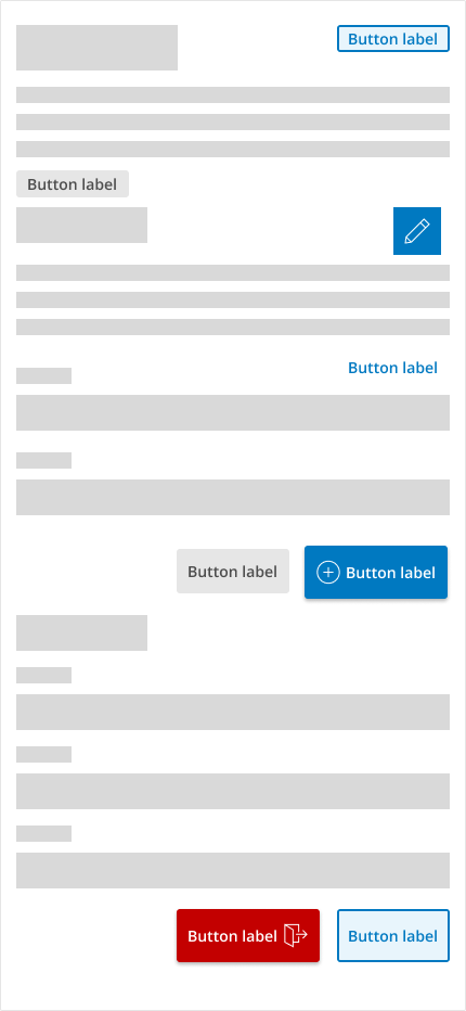
Escape
<q2-btn intent="workflow-escape" type="button" size="medium">My Button</q2-btn>
- Canceling or Exiting: q2-button intent: escape buttons are commonly used to cancel or exit processes, dialogs, or modals without saving any changes. For example, in a settings menu, a neutral button labeled "Cancel" might allow users to discard any modifications they've made without applying them.
- Returning to a Previous State: Escape buttons can also be used to revert to a previous state or screen within an application or website. For instance, in a multi-step process, a neutral button labeled "Previous" or "Back" might allow users to navigate to the previous step without committing to any new action.
Escape Buttons Guidelines:
- Escape buttons are mainly used in modals or flyouts as a reverse or escape action or when returning to a previous place or state.
- Examples: Cancel, Close, Dismiss, Don't save.
Destroy
<q2-btn intent="workflow-destroy" type="button" size="medium">My Button</q2-btn>
- Data Deletion: A "destroy" button might refer to a button or action that permanently deletes data or content in certain applications or interfaces. This could be used when users want to delete their accounts, erase personal data, or permanently remove sensitive information.
- Irreversible Actions: The term "destroy" could also imply irreversible actions, where users are warned about the permanent consequences of their actions. For example, in an editing application, a "destroy" button might be used to flatten or merge layers with a warning about the irreversible nature of the operation.
- Emergency Situations: In critical or emergency situations, a "destroy" button might be used to initiate actions that have a significant impact, such as shutting down systems, terminating processes, or triggering fail-safe mechanisms.
- Confirmation of Intention: The use of a "destroy" button could also serve as a confirmation mechanism, requiring users to explicitly acknowledge their intention to perform a critical or irreversible action. This helps prevent accidental or unintended actions.
- Security Measures: A "destroy" button might trigger security protocols in security-sensitive workflows, such as wiping data remotely from a lost or stolen device or revoking access permissions.
Destroy Buttons Guidelines:
- Only use the q2-button intent: Destroy buttons when a severe action results in a perceived negative action.
- Example: Delete.
Icon only
<q2-btn type="button" size="medium">
  <q2-icon type="edit">
  </q2-icon>
  <span>
  </span>
</q2-btn>
- Visual Representation: Icon buttons use graphical icons or symbols instead of text labels to represent actions or functions. This visual representation can convey meaning quickly and intuitively, especially across different languages or cultures.
- Conservation of Space: Icon buttons, such as mobile apps or toolbars, are often used in interfaces where space is limited. By using icons instead of text labels, designers can conserve space and display more options within a confined area.
- Recognition and Memorability: Well-designed icons can become recognizable and memorable symbols for specific actions or functions. Over time, users learn to associate certain icons with particular actions, enhancing usability and efficiency.
- Enhanced Aesthetics: Icons can add visual interest and aesthetic appeal to an interface, contributing to a more polished and engaging design. They can help create a visually balanced layout and improve an application or website's overall look and feel.
- Touchscreen Interaction: In touchscreen interfaces, icon buttons are particularly useful because they provide larger clickable areas than text links or buttons. This improves touch accuracy and makes it easier for users to interact with the interface, especially on small screens.
- Customization and Personalization: Icon buttons can be customized to match an application's or website's branding or visual style. Designers can choose icon designs, colors, and sizes that align with the overall design language, creating a cohesive and branded experience.
- Accessibility: When designing icon buttons, it's important to consider accessibility principles. Icons should be clear, recognizable, and distinguishable, especially for visually impaired users. Providing alternative text descriptions or tooltips can also enhance accessibility for all users.
- Consistency and Standards: Following established iconography standards and conventions is important to ensure usability and familiarity. Using commonly understood symbols and maintaining consistent icon design across the interface helps users understand their meaning and function more easily.
Icon Buttons Guidelines:
- Icon buttons should always be paired with an understandable tooltip
Accessibility Considerations
Link Vs Button
Choosing between using a link or a button in web design depends on the intended action and the context it presents. Here's a breakdown:
- Links:
- Navigation: Links are commonly used for navigation, especially when directing users to other pages within the same website or external resources.
- Text-Based: If the action is primarily text-based, such as "Read more", "Learn more", or "Continue reading", a link is often more appropriate.
- In-line actions: When the action is part of a body of text or content, clicking it doesn't change the state of anything on the page (e.g., clicking a link to open an external resource in a new tab).
- Buttons:
- Interactive Actions: Buttons are best suited for interactive actions where the user acts such as submitting a form, confirming a choice, or initiating a process.
- Calls to Action (CTAs): If you want to draw special attention to an action, such as "Sign Up", "Buy Now", or "Download", buttons are more visually prominent and are thus more effective.
- Visual Feedback: When clicked, buttons often provide visual feedback, such as changing color or size momentarily, which can confirm to the user that their action was successful.
In summary, links are generally used for navigation and textual actions, while buttons are used for interactive actions and calls to action. However, the choice should also consider usability and accessibility principles, ensuring that users can easily understand and interact with the elements on the web page.
Interactions with Screen Readers
When a screen reader user encounters a button or link, their screen reader is going to read the HTML tag and tell them if they are on a button or a link, and then read the text or aria-label for that button or link.
So for a link like this: <a href="/about">Learn More About Us</a>, a screen reader user would hear, "Link. Learn more about us." This is same even if that link were styled to look like a button (for example by adding class="button" to the link), because the screen reader is using the <a> tag to know that this is a link.
If the element was a button, like this: <button>Close Popup</button>, they would hear, "Button. Close popup."
Visual and Affordance Guidelines
Decorative Icons in Buttons
<q2-btn intent="workflow-primary">
  <q2-icon type="add">
  </q2-icon>
  <span>Add</span>
</q2-btn>
Decorations on buttons can help indicate the user's intent for the action. Icons can become recognizable and memorable symbols for specific actions or functions. Over time, users learn to associate specific icons with particular actions, enhancing usability and efficiency.
Icon in Button Guidelines:
- Decorative Q2-icons are always placed on the left side of the UUX button.
- Only Primary, Link-neutral, Neutral, Destroy, and icon-only buttons can have icons attached. Secondary and escape should not be decorated with icons since they are reductive or secondary actions.
- Icons need to relate to the button's intent clearly. Signifiers indicate functional actions meant to tap into existing mental models or build new ones.
Signifier Icons in Buttons
<q2-btn intent="workflow-primary">
  <span>Options</span>
  <q2-icon type="edit">
  </q2-icon>
</q2-btn>
Signifiers help users understand the functionality and behavior of objects or elements, reducing cognitive load and enhancing usability.
- Explicit Communication: Signifiers directly communicate specific actions, functions, or states to users. They provide clear and unambiguous indications of how users can interact with an interface or what actions they can perform.
- Accessibility: Signifiers should be designed with accessibility in mind to ensure that all users can perceive and understand them. This includes considerations for color contrast, text alternatives for non-textual signifiers, and compatibility with assistive technologies such as screen readers.
- Learnability and Discoverability: Signifiers contribute to UUX's learnability and discoverability by helping users understand how to interact with it. Intuitive and well-placed signifiers help users quickly grasp the functionality of elements and navigate the interface effectively.
Icon Signifiers in button Guidelines:
- Signifiers in a Q2 button are always placed on the right.
- Signifiers are generally related to the button's effect on the UI, such as flyouts like dropdowns or calendars that pop out when clicked.
Size
<q2-btn type="button" intent="workflow-primary" size="medium">My button</q2-btn>
<q2-btn type="button" intent="workflow-primary" size="small">My button</q2-btn>
<q2-btn type="button" intent="workflow-primary" size="large">My button</q2-btn>
Button size Rules:
- Medium-sized buttons are the default for buttons across the platform.
- Small buttons can be used in tables, cards, and smaller objects that require space savings.
- Larger buttons are rarely used in q2 systems but can be selectively used for CTAs .
Patterns
Provide clean examples of how to compose multiple components together in order to achieve a specific visual outcome that is curated and maintained by Tecton.
Inline patterns
Grouping Buttons
When to group buttons together and how to do it correctly using q2-btn and q2-action-group.
When you have two or more related actions sitting next to each other, for example a primary "Save" button next to a secondary "Cancel" button, wrap them in a
q2-action-group. This gives them consistent spacing, alignment, and responsive behavior on small screens.Avoid stacking
q2-btnelements directly inside a flex or grid container withoutq2-action-group.Save Cancel <q2-action-group> <q2-btn intent="workflow-primary">Save</q2-btn> <q2-btn intent="workflow-secondary">Cancel</q2-btn> </q2-action-group>Coin Buttons
How to build a row of coin-style buttons that group related top-level actions like account shortcuts.
Coin buttons are circular icon-and-label buttons used for prominent shortcuts, typically along the top of a page or section. Use them to surface a small, fixed set of related actions (for example: Statements, Transfers, Settings, Sign Out).
Limit coin buttons to 3 to 5 actions per group, and give each button a distinct icon that clearly represents its action. Avoid using the same icon for multiple buttons in a single group; the visual differentiation is what makes coin buttons scannable.
A coin button takes a
q2-avatarelement as its child and usesintent="coin". Wrap the set in aq2-action-groupso they pick up consistent spacing, alignment, and responsive behavior.<q2-action-group> <q2-btn intent="coin" label="Statements"> <q2-avatar icon="statements"></q2-avatar> </q2-btn> <q2-btn intent="coin" label="Transfers"> <q2-avatar icon="transfer"></q2-avatar> </q2-btn> <q2-btn intent="coin" label="Settings"> <q2-avatar icon="gear"></q2-avatar> </q2-btn> <q2-btn intent="coin" label="Sign Out"> <q2-avatar icon="logout"></q2-avatar> </q2-btn> </q2-action-group>
Full-page patterns
Account List Page
How to build an Account List page in Tecton: a summary header and a searchable, client-filtered account list.
Account Settings Page
How to build an Account Settings page in Tecton: six independent settings sections covering nickname, notifications, statement delivery, card management, spending limits, and overdraft protection.
Bank Statement Page
How to build a Bank Statement page in Tecton: a computed account summary and a q2-data-table of transactions for a statement period.
Funds Transfer Page
How to build a Funds Transfer form in Tecton: a single-column transfer with rich account options, a recurrence schedule, and client-side validation.
Message Center Page
How to build a Message Center page in Tecton: a two-panel layout with a message list on the left and a selected message detail plus response form on the right.
Profile Page
How to build a Profile page in Tecton: required-field validation for personal information, real-time cross-field password validation, and plain integration toggles.
Accessibility
Accessibility Report
CSS Variables
The following CSS variables are available to override the default theme styles of the q2-btn component.
Dependencies
Many Tecton components consume other components to maintain visual and functional consistency. If you are looking for a CSS variable you think should exist but are not seeing it, it may be defined in one of the dependent components below. Either way, if you think it's something we should expose more conveniently, let us know!
Changelog
The changelog provides a detailed history of new features, improvements, and bug fixes going back to Tecton 1.30.0. If the button is disabled, it indicates there have been no detectable changes since then.