Item
- Updated:
Use for laying out structured content with header, body, and footer text, icons, and actions.
Development
Building Complex Layouts
The item component was built to provide a standard layout for various data types. It uses a series of slots combined with basic styling to give you a vast amount of flexibility in the information you may want to present to users. Here are a number of examples of what you can do with this component.
Account Information
<q2-item>
    <q2-avatar
        slot="decorator"
        src="/examples/logo.svg"
    ></q2-avatar>
    <div slot="header">Checking Account</div>
    <q2-detail
        label="Account Number"
        description="xxxx-xxx-0745"
        slot="body"
    ></q2-detail>
    <div slot="footer">
        <q2-detail
            label="Account type"
            description="Loan"
        ></q2-detail>
        <q2-detail
            class="mrg-y(3x)"
            alignment="left"
            label="Interest Rate"
            description="3.5%"
        ></q2-detail>
        <q2-detail
            class="mrg-y(3x)"
            alignment="left"
            label="Interest Earned (YTD)"
        >
            <q2-currency amount="34.15"></q2-currency>
        </q2-detail>
        <hr />
        <q2-detail
            class="mrg-y(3x)"
            alignment="left"
            label="Current Balance"
            size="small"
        >
            <q2-currency amount="12953.25"></q2-currency>
        </q2-detail>
        <q2-detail
            class="mrg-y(3x)"
            alignment="left"
            label="Available Balance"
            size="small"
        >
            <q2-currency amount="12782.19"></q2-currency>
        </q2-detail>
    </div>
    <q2-dropdown
        slot="action"
        type="icon"
        label="My dropdown"
        icon="options"
        popover-alignment="right"
        hide-label
    >
        <q2-dropdown-item value="first">First</q2-dropdown-item>
        <q2-dropdown-item value="second">Second</q2-dropdown-item>
        <q2-dropdown-item value="third">Third</q2-dropdown-item>
    </q2-dropdown>
</q2-item>
Contact Information
<q2-item>
    <q2-avatar
        slot="decorator"
        src="/examples/headshot.jpg"
    ></q2-avatar>
    <div slot="header">Maria Chen</div>
    <q2-detail
        label="Company"
        description="Mountaintop Souvenirs"
        slot="body"
    ></q2-detail>
    <q2-detail
        label="Mobile"
        description="(555) 555-5555"
        slot="body"
    ></q2-detail>
    <q2-detail
        label="Email"
        description="maria.chen@mountaintop-souvenirs.com"
        slot="body"
    ></q2-detail>
    <q2-dropdown
        slot="action"
        type="icon"
        label="My dropdown"
        icon="options"
        popover-alignment="right"
        hide-label
    >
        <q2-dropdown-item value="first">First</q2-dropdown-item>
        <q2-dropdown-item value="second">Second</q2-dropdown-item>
        <q2-dropdown-item value="third">Third</q2-dropdown-item>
    </q2-dropdown>
</q2-item>
Message
<q2-item>
    <q2-avatar
        slot="decorator"
        icon="mail"
    ></q2-avatar>
    <div slot="header">Payment Due</div>
    <q2-detail
        label="From"
        description="Thrive Bank"
        slot="body"
    ></q2-detail>
    <q2-detail
        label="Received"
        slot="body"
    >
        <q2-relative-time
            date="2024-12-10"
            unit="day"
            message-format="long"
        ></q2-relative-time>
    </q2-detail>
</q2-item>
Slots
The q2-item element has multiple slots that can be used to insert custom content into the component.
An optional slot to display custom content in the action area. Supports buttons, checkboxes, dropdowns, or other interactive elements related to the item.
An optional slot to display custom content in the body area. Use this to provide the main content of your item.
An optional slot to display custom content in the footer area. Use this to provide additional information or actions related to the item.
An optional slot to display custom content in the header area. Use this to provide a title or label for your item.
Properties
clickableMakes the item clickable.
verticalAlignvertical-alignControls the vertical alignment of the item decorator and single content slot.
Dependencies
This component uses other components in the Tecton library, including:
Dependents
Other components in the Tecton library use this component, including:
q2-contextq2-file-picker
Design
Design Overview
The Item component is designed to be used within the List component, especially when displaying a vertically stacked, repeating set of content. Its flexible slot-based anatomy allows for a wide range of layouts and use cases.
When to Use
Use the Item component inside the List component when presenting stacked content that benefits from easy visual scanning. Its side-by-side cell layout helps users quickly scan a vertical list to locate specific information.
Anatomy
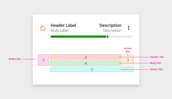
The Item component is composed of five customizable slots (illustrated above), providing flexibility in structure and content. It supports the inclusion of the Detail and Currency components for enhanced data presentation.
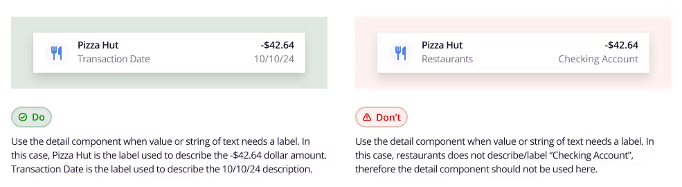
- Detail Component: Use this only when a label is necessary to clarify a value or piece of text. It should not be used solely for layout or visual styling.
- Currency Component: Useful for displaying monetary values consistently within the item layout.
Detailed Guidance
Slot Usage
- Decorator Slot (formerly "Bullet")
- q2-avatar
- q2-icon
- null
- Header Slot
- Detail component in all sizes.
- Action Slot
- Button or Link
- Checkbox
- Dropdown
- Pill
- Null
- Body Slot
- Detail Component in all sizes
- Footer Slot
- Up to 3 detail components stacked.
Patterns
Provide clean examples of how to compose multiple components together in order to achieve a specific visual outcome that is curated and maintained by Tecton.
Full-page patterns
Account Details Page
How to build an Account Details page in Tecton: a sortable, filterable transaction list with client-side search, column sorting, and pagination.
Account List Page
How to build an Account List page in Tecton: a summary header and a searchable, client-filtered account list.
Account Settings Page
How to build an Account Settings page in Tecton: six independent settings sections covering nickname, notifications, statement delivery, card management, spending limits, and overdraft protection.
Funds Transfer Page
How to build a Funds Transfer form in Tecton: a single-column transfer with rich account options, a recurrence schedule, and client-side validation.
Message Center Page
How to build a Message Center page in Tecton: a two-panel layout with a message list on the left and a selected message detail plus response form on the right.
Accessibility
Accessibility Report
CSS Variables
The following CSS variables are available to override the default theme styles of the q2-item component.
Changelog
The changelog provides a detailed history of new features, improvements, and bug fixes going back to Tecton 1.30.0. If the button is disabled, it indicates there have been no detectable changes since then.