Link
- Updated:
Use for navigation to other pages or sections. Prefer over q2-btn for non-action navigation.
Properties
disabledDetermines whether the component and tctClick event are disabled.
ellipsisIf true, the label will be truncated with an ellipsis when it's too long.
fullWidthfull-widthIf true, it takes up 100% width.
hrefThe link when clicked.
iconTypeicon-typeThe q2-icon to display when variant is set to "standalone".
labelThe displayed label to represent your link.
referrerpolicyHow much of the referrer to send when following the link. See MDN for more information on referrerpolicy.
targetWhere to display the linked URL. See MDN for more information on target.
tctTitletct-titleApplies a title attribute to the anchor tag in the shadowRoot of the component.
variantDetermines the visual display style of the link.
Events
The q2-link element exposes events that can be used to send and receive data from the component based on user interaction.
tctClick
Emitted when the link is clicked.
Event Detail Type signature
{ target: string; referrerpolicy: string; href: string; }If an event handler is bound to the element using:
ontctClickproperty - The default handler will not fire, and the value must be updated in the custom handler.addEventListener("tctClick")method - The default handler will fire alongside the custom handler.
Methods
The q2-link element exposes methods that can be used to perform various actions on the component.
clickLink
A method for click.
Type signature
clickLink() => Promise<void>Dependencies
This component uses other components in the Tecton library, including:
q2-icon
Dependents
Other components in the Tecton library use this component, including:
q2-file-picker
Design
Overview
Links are navigational elements that can be used on their own or inline with text. They provide a lightweight option for navigation, but like other interactive elements, too many links will clutter a page and make it difficult for users to identify their next steps. This is especially true for inline links, which should be used sparingly.
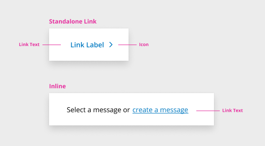
**Standalone link: **Links that are used on their own or directly following content. These do not use underlines and must be paired with an icon.
Inline Link: Inline links are placed in body copy and are used to indicate reference material.
Anatomy
Usage
When To Use
Use when you want users to:
- Navigate to a different page within the application
- Navigate to an entirely different website
When To Not Use
- Do not use links to trigger an action on a page or complete tasks in other components (forms and modals) - use buttons instead as outlined below.
- Do not use links for actions that will change data or manipulate how it is displayed.
Link: A link can be used to navigate a user to another page or website, another place on the same page, or to open a link in a new tab. Activating a link changes the URL. It is not intended to be used as a trigger for an action. A button is more appropriate for elements that trigger an action when activated.
Button: This is used to trigger an action on a page or to complete tasks in other components, such as forms and modals. Exception: "Back" and "Next" buttons may be used to navigate a guided experience.
Usability Guidance
- For the standalone link, we recommend using a 44px touch zone when possible for mobile users.
- Our default link is set at 24px to allow for special tighter layouts. But we do recommend using a 44px touch zone when possible.
- Use an icon affordance with your link to identify what it will do - the standalone link has a mandatory icon that provides this affordance.
- Use the external link icon to communicate that a link is external
- Link directly to the most relevant page
- Avoid links to pages that require further user action to locate the intended information.
- Use unique, meaningful link text.
- Link text should explain the link's purpose and help the user understand the link's destination. Vague and repetitive text like "click here" or "read more" is unhelpful to screen-reading software users. Screen-reading software collects all page links into a single list, and users typically start with that list. When they do so, they cannot tell the difference between links with similar wording.
Accessibility Guidance
-
Allow keyboard navigation of links.
- Users should be able to navigate between links by using the "Tab" key and activate a link by pressing the "Enter" key.
-
Use unique, meaningful link text.
- Link text should explain the link's purpose and help the user understand the link's destination. Vague and repetitive text like "click here" or "read more" is unhelpful to screen-reading software users. Screen-reading software collects all page links into a single list, and users typically start with that list. When they do so, they cannot tell the difference between links with similar wording.
- WCAG 2.1: 2.4.4 Link Purpose (In context) (https://www.w3.org/WAI/WCAG21/Understanding/link-purpose-in-contexthttps://www.w3.org/WAI/WCAG21/Understanding/link-purpose-in-context), 3.2.4 Consistent Identification (https://www.w3.org/WAI/WCAG21/Understanding/consistent-identification)
- Link text should explain the link's purpose and help the user understand the link's destination. Vague and repetitive text like "click here" or "read more" is unhelpful to screen-reading software users. Screen-reading software collects all page links into a single list, and users typically start with that list. When they do so, they cannot tell the difference between links with similar wording.
-
Do not mix the usage of links and buttons, as outlined above
- Links are for navigating, not triggering actions. Misuse causes problems for keyboard and screen reader users who interact with these elements differently, and will be confused if they hear them announced by the wrong role
-
When using the standalone link, the icon should have a proper aria-label
Accessibility
Accessibility Report
CSS Variables
The following CSS variables are available to override the default theme styles of the q2-link component.
Dependencies
Many Tecton components consume other components to maintain visual and functional consistency. If you are looking for a CSS variable you think should exist but are not seeing it, it may be defined in one of the dependent components below. Either way, if you think it's something we should expose more conveniently, let us know!
Changelog
The changelog provides a detailed history of new features, improvements, and bug fixes going back to Tecton 1.30.0. If the button is disabled, it indicates there have been no detectable changes since then.