Aesthetics
- Updated:
How Tecton's aesthetic styling system applies a per-theme CSS-custom-property layer to extension iframes.
Aesthetics give a platform's theme a structural design language — corner radii, border treatments, drop shadows, surface density — independent of brand identity. Tecton injects the active aesthetic's CSS-custom-property layer into each extension iframe, so every extension renders with the same structural character the host platform chose, without each extension needing to ship per-aesthetic styling itself.
What an Aesthetic Is
An aesthetic defines the structural language of Tecton components — how form fields are shaped, where borders and shadows sit, how dense the layout is. Think of it as the "body style" of a car. The platform's theme is the "paint job": colors, icons, gradients, typography, and animation.
The two layers are deliberately separable:
- Aesthetics control structure: border radii, stroke widths, shadows, padding, density.
- Themes control brand identity: palette, fonts, icon styles, motion.
A platform can pair any theme with any aesthetic. Themes can also override individual values set by an aesthetic, so platforms keep full control of the final presentation.
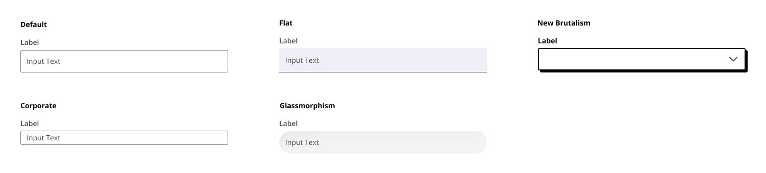
The image below depicts the automatic styling Tecton applies to the q2-input component across several aesthetics — the same underlying component, restyled by the active aesthetic's structural rules.
From the Platform Perspective
A platform exposes its active aesthetic through two capabilities, both of which are optional. When the platform doesn't advertise getThemeInfo, the SDK loads the standard aesthetic by default so extensions remain styled. When the platform doesn't advertise themeInfoChanged, the SDK applies the aesthetic once at connection time and leaves it static for the lifetime of the extension. Supporting both gives users live aesthetic switches reflected in embedded extensions without re-connecting.
getThemeInfo
Returns the active theme name and aesthetic on demand. The platform implements this as a request handler; the SDK calls it once during connect() initialization.
The response shape:
{
    themeName: string;
    aesthetic: string | null;
}
aesthetic is the slug of the active aesthetic (for example "flat" or "glassmorphism") or null when the platform hasn't selected one for the active theme.
themeInfoChanged
A broadcast capability. The platform emits this whenever the active theme or aesthetic changes; the SDK re-applies the aesthetic styling inside the iframe. The broadcast payload matches getThemeInfo's response shape.
From the Extension Perspective
Extensions don't have to do anything to receive an aesthetic — the SDK applies the platform's active aesthetic automatically after connect() by loading the matching aesthetic stylesheet into the iframe. When the active aesthetic changes, the SDK swaps the stylesheet in place. Extension CSS doesn't need to load anything itself, and extensions are expected to render under whatever aesthetic the host platform has selected for a uniform look-and-feel across the environment.
Fallback When the Platform Isn't Aesthetic-Aware
When an extension's Tecton SDK version supports aesthetics but the host platform doesn't advertise getThemeInfo, or advertises it but returns aesthetic: null, the SDK falls back to loading the standard aesthetic. standard is a backward-compatible look that replicates the pre-2025 Helix Slate / UUX style, so extensions on aesthetic-aware SDKs still render with a coherent design language even when paired with an older platform.
Reading the Active Aesthetic in Extension Code
For extension code that needs to know which aesthetic is active — for example to choose between asset variants — the same ThemeInfo is available through Tecton's source APIs:
import { connect } from 'q2-tecton-sdk';

const tecton = await connect();

// Read the current aesthetic
const info = await tecton.sources.getThemeInfo?.();
if (info?.aesthetic === 'glassmorphism') {
    // ...
}

// Or subscribe to changes
const unsubscribe = tecton.sources.themeInfoChanged?.(({ themeName, aesthetic }) => {
    // ...
});
Both source functions return undefined when the platform doesn't advertise the corresponding capability — extension code should guard the call (via ?.) and handle the absent case gracefully.
The Aesthetic Catalog
Tecton currently ships seven aesthetics through the tecton-aesthetics package. Each is published as a standalone stylesheet and loaded into the extension iframe by slug.
| Slug | Design name | Description |
|---|---|---|
default-2026 |
Modern (New Default) | The new default Tecton style. Clean, contemporary baseline. |
flat |
Flat | No corner radius, no drop shadow. Similar in spirit to Material Design. Clean and utilitarian. |
glassmorphism |
Glassmorphism | Uses backdrop-filter (blur, saturate, contrast, brightness) for a frosted-glass effect with rounded corners. |
high-visibility |
High Visibility | Emphasizes strong, solid component borders and contrasting outlines for improved visual distinction across the UI. |
minimalist |
Minimalist | Smaller form-field heights and reduced density. Stripped back and space-efficient. |
neo-brutalist |
New Brutalist | Heavy 2px border strokes and a flat drop shadow (no blur, no spread). Bold, raw, and intentionally stark. |
standard |
Classic | Backward-compatible look and feel that replicates the pre-2025 Helix Slate / UUX style. |
For Platform Developers: Extending Aesthetic Coverage to Older Extension SDKs
Platforms can apply the aesthetic CSS-custom-property layer to extension iframes whose embedded Tecton SDK is below 1.68, so those extensions still render with the platform's structural design language. Older SDKs don't set the body attribute or load the aesthetic stylesheet themselves, so the platform's theme CSS mirrors the active aesthetic's variable declarations into the iframe directly — typically under a body:not([data-tecton-aesthetic]) selector that matches only when the SDK-side stylesheet isn't in play.
UUX is the reference implementation of this pattern. Its theme SCSS keeps a $theme-aesthetic switch that emits the active aesthetic's mixin under body:not([data-tecton-aesthetic]), plus a $tecton-aesthetic-mixin-shim map that lets individual platform themes register per-aesthetic CSS overrides — useful for fixing visible style bugs in older-SDK extensions without cutting a support patch for each one.
Extensions on Tecton 1.68 and later load aesthetics/<slug>.css directly via the SDK-injected link tag, and the platform-side mirror doesn't apply (the body attribute is set, so the :not() selector doesn't match). The same theme SCSS works in both directions.