Overview
Styling & Design
The design decisions beneath every component — tokens, color, typography, and spacing — that keep Q2 products visually consistent across teams and themes.
--const-* (fixed constants), --app-* (application scale), and --t-* (theme). Read Styling Components for more information.Try it — restyle the components
Looks native. Zero CSS required.
Components carry two layers of visual identity. First, the platform's theme tokens — brand color, radius, and type — inherited automatically at runtime. On top of that sits the chosen aesthetic: spacing, elevation, borders, and motion that reshape every component together. Need to go further? Component-level CSS variables give you fine-grained control.
Explore Styling Components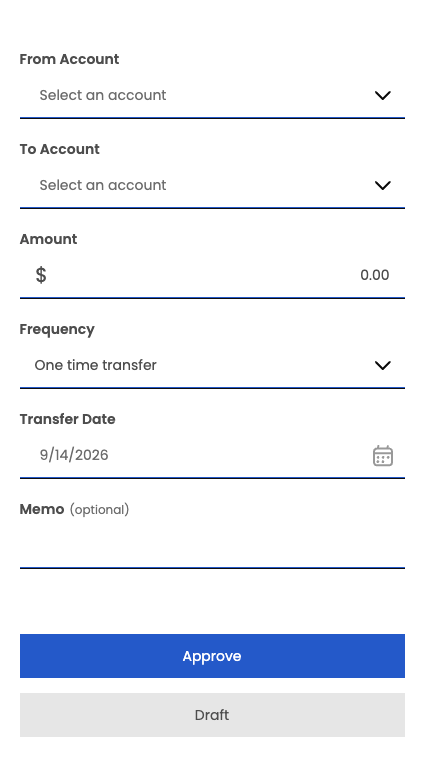
Semantic color, not raw hex.
Every color in Tecton has a name — not a value. Brand colors are expressed as --t-primary, statuses as --const-stoplight-success, and surfaces as --t-base. When a platform updates its theme, every component that references those tokens updates automatically — no find-and-replace, no overrides.
Consistent space, everywhere.
Spacing in Tecton isn't arbitrary — it follows a multiplier scale rooted in a single base unit. The same --app-scale-* tokens that control a component's internal padding govern the gaps between sections on your page. A 12-column grid and responsive container utilities give structure at any breakpoint.
Reference
Color System
A set of colors used to create a consistent look and feel across the application.
Containers and Spacing
Shadow, border radius, and spacing constants that create consistent use of variables throughout the Tecton components.
Functional CSS Classes
CSS classes that accept arguments corresponding to a value, such as a pixel size, color, or duration, and can be applied to Tecton elements and your own markup.
Typography
CSS utility classes for controlling typography and text styles in Tecton-powered applications.
Theming
Styling Components
An explanation of how Tecton uses CSS variables to style components, and how to approach styling changes in different scenarios.
Aesthetics
How Tecton's aesthetic styling system applies a per-theme CSS-custom-property layer to extension iframes.
Techniques
Action Sheets
An alternative workflow for displaying dropdown content when space is limited.
Loading States
How to customize the loading state of an extension using the q2-loading component.
Outlet Selectors
How to identify outlet contexts so platform theme CSS can target extensions by where they render.